Electrons Visual
Details
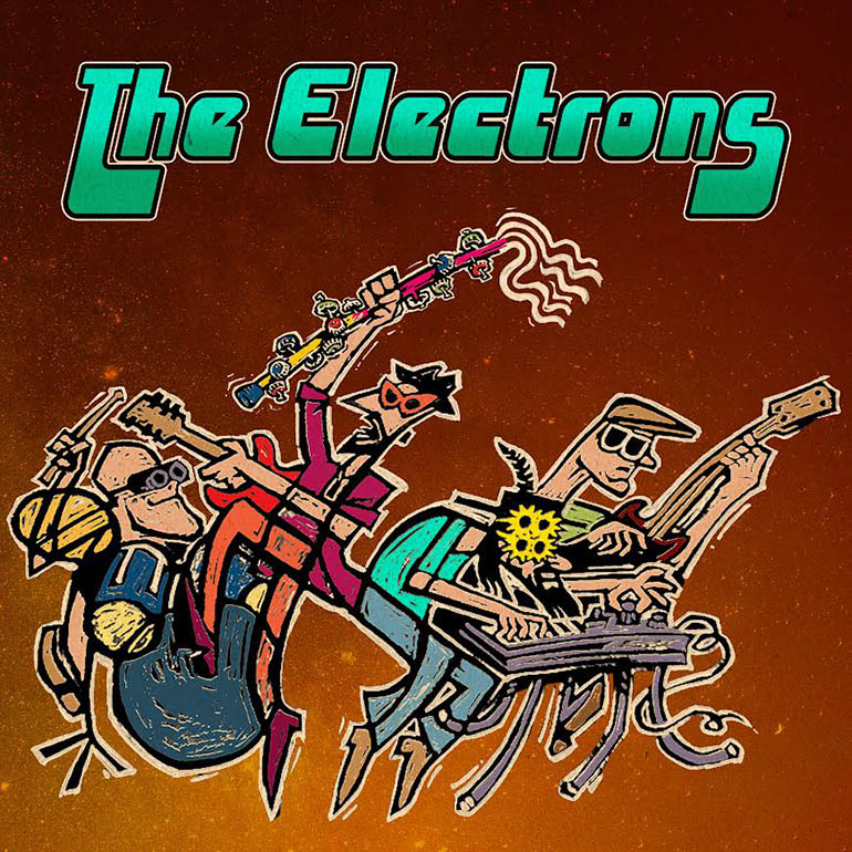
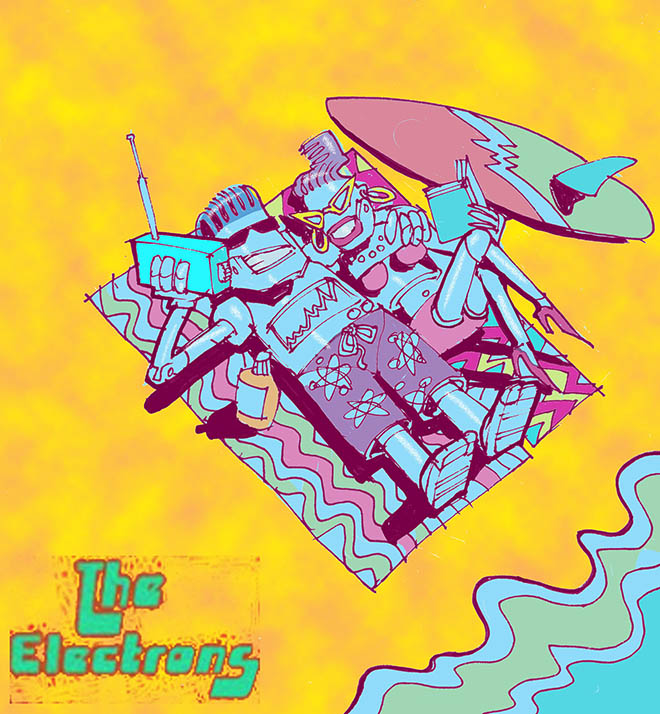
A tentative design idea for the album cover.
Deemed 'too laid back'
to faithfully represent the product.
Deemed 'too laid back'
to faithfully represent the product.
Year
2023
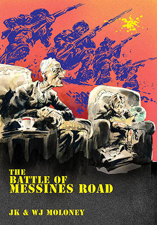
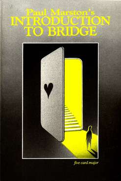
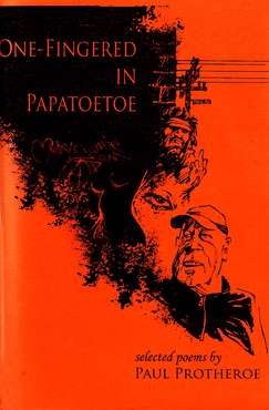
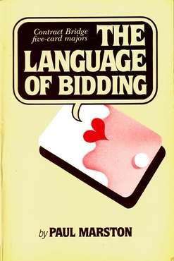
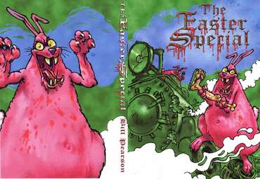
I always judge a book by its cover.
Designing a cover is always an interesting and challenging assignment - often involving several discussion visuals. The cover should obviously convey the book’s ‘vibe’ (good ol’ hippy word) but must also appeal to the author, his publisher, his readership and his retailer - and their tastes can be quite divergent!
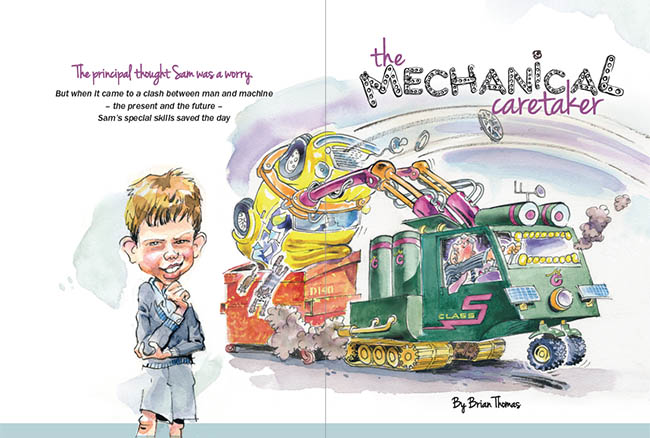
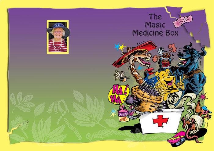
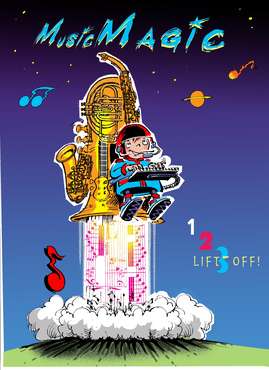
Covers for younger kids usually need to be quite dynamic and colourful. The blocks of dark shadow that might add drama for a teenage or adult eye tend to just look gloomy to the young.
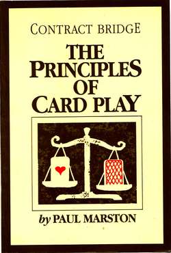
And covers require words. Typography is interesting stuff - very emotive.
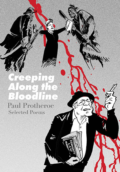
A serifed font can still convey dignity and authority while a looser, sans serif one can look more contemporary and urgent. The marriage of type and art is always an interesting element of cover design.
Musicians often require covers. These days they’re usually viewed at playing card size on your spotify screen - or postage stamp size on your phone.
With the renewed interest in vinyl there is the return, to a degree, of the legendary foot square album cover - brilliant!
I’ve never had one of those commissions but I have had CD covers blown up to be posters the size of a horse ( well, a sheep) to promote a band’s launch and tour.